
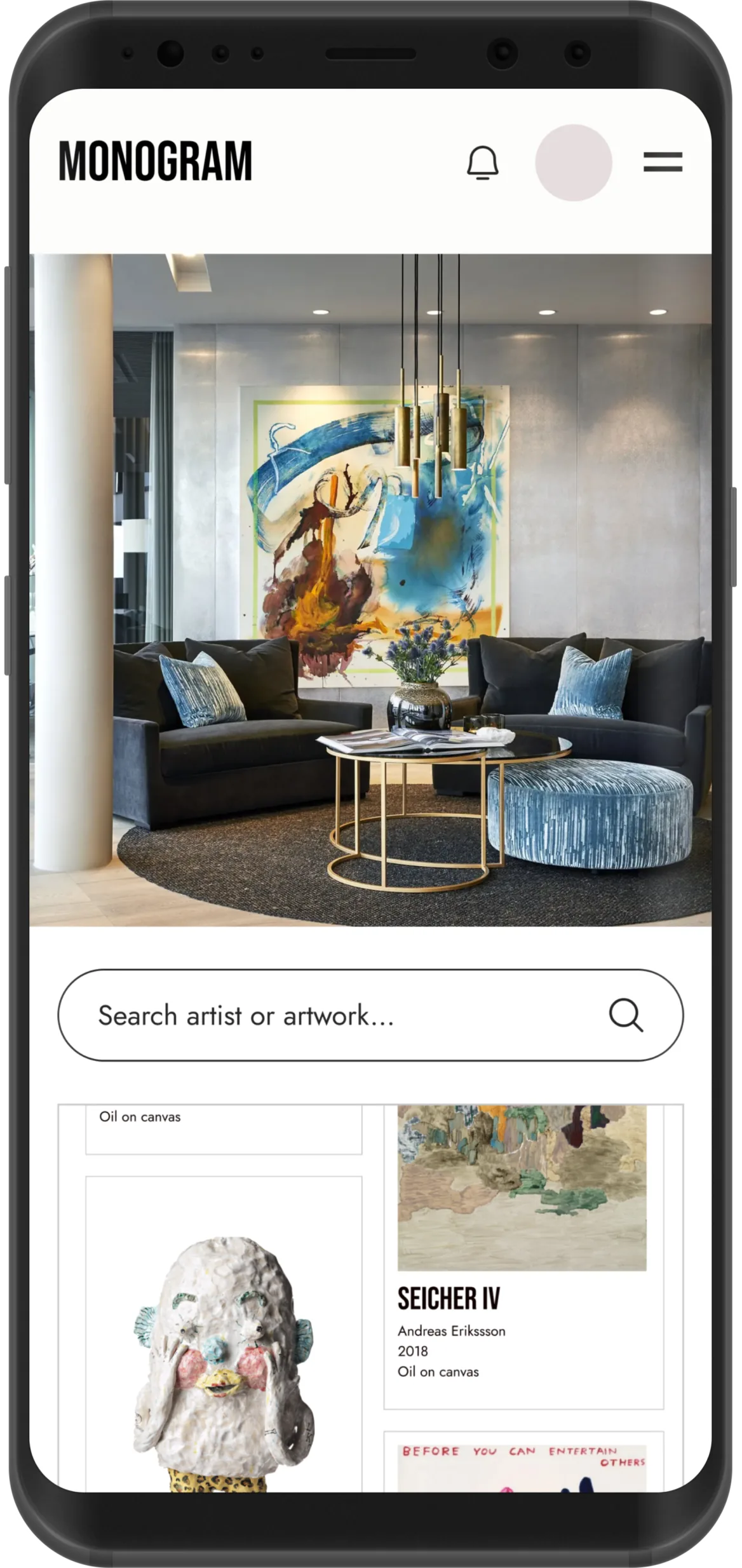
Monogram B2B
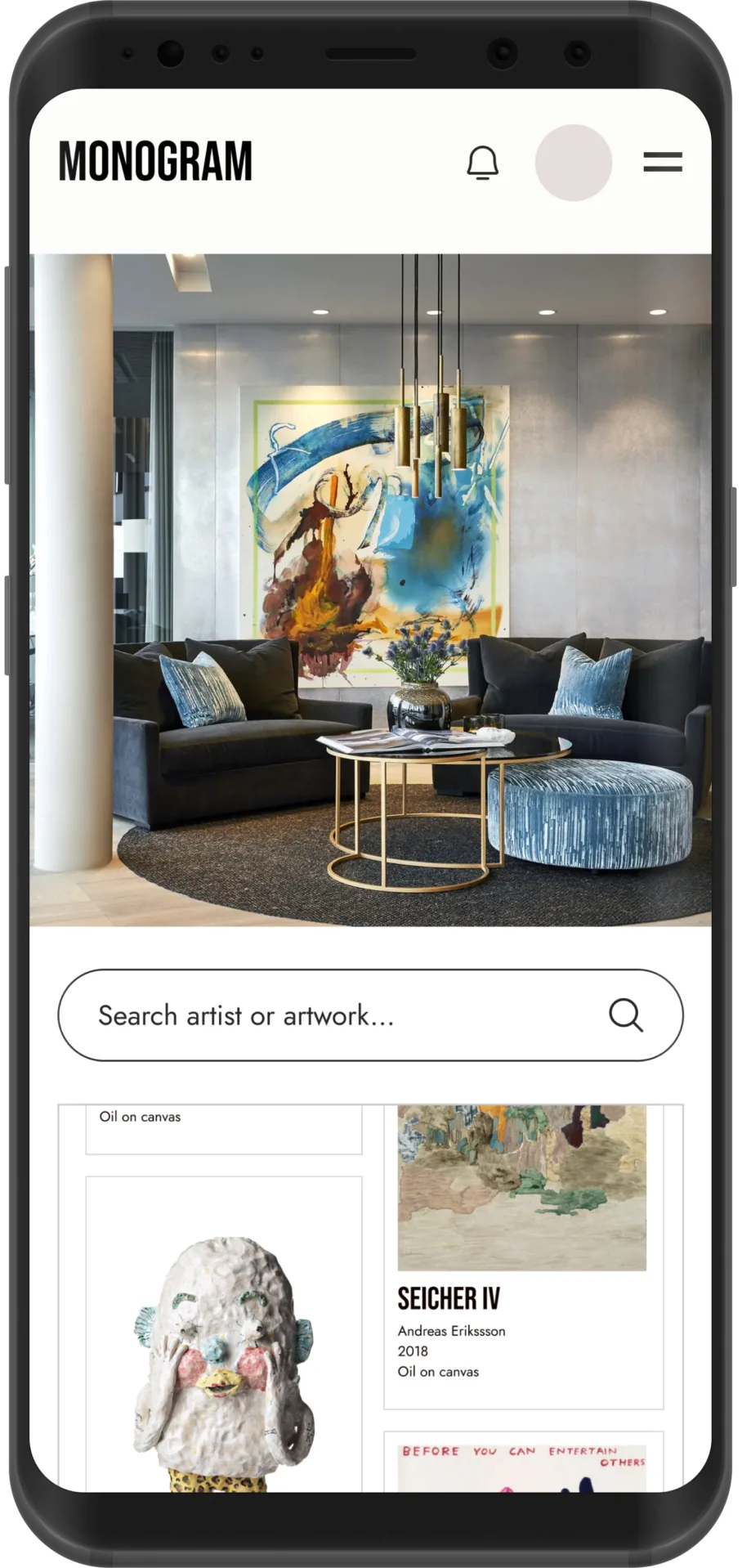
Phase two of Monogram: a version for companies with their own art collections, letting them invite employees to explore the art they own.
The challenge
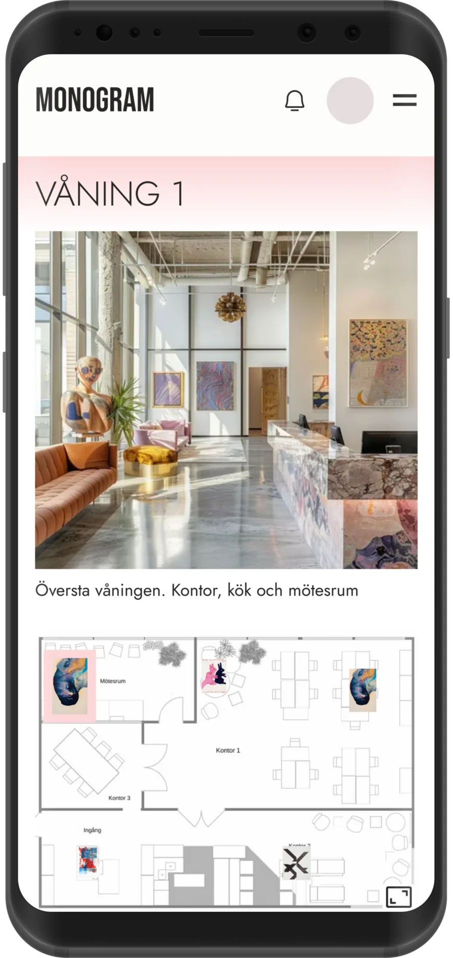
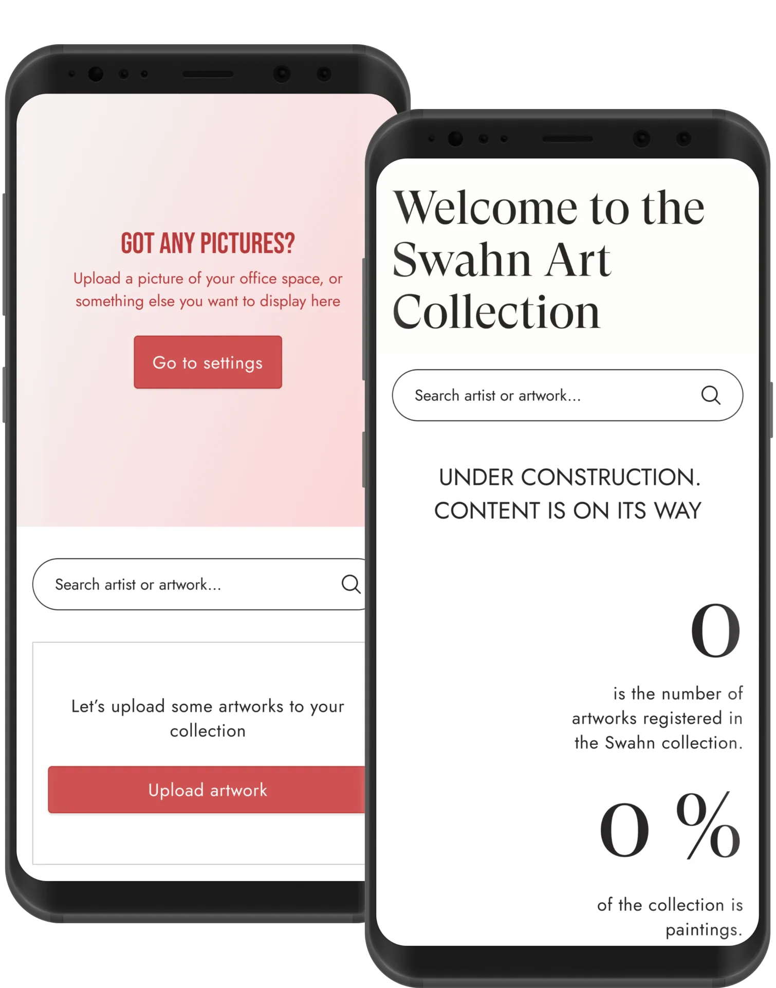
Extend Monogram to companies, where one admin manages the collection and everyone else explores it. We started with a thorough planning phase, turning user stories and scenarios into concrete features before any UI was designed.
My role
I worked closely with the lead designer across the full product lifecycle, from UX exploration and interface design to testing, iteration and developer handoff. As we moved toward launch, I also took on extra responsibility for QA.
Designing a complex product
Two very different users share the same service. Admins need deeper functionality, editable states and guidance, almost a CMS of its own. Users need something lighter and more informative. The trick was holding both mental models at once without it feeling like two separate tools.
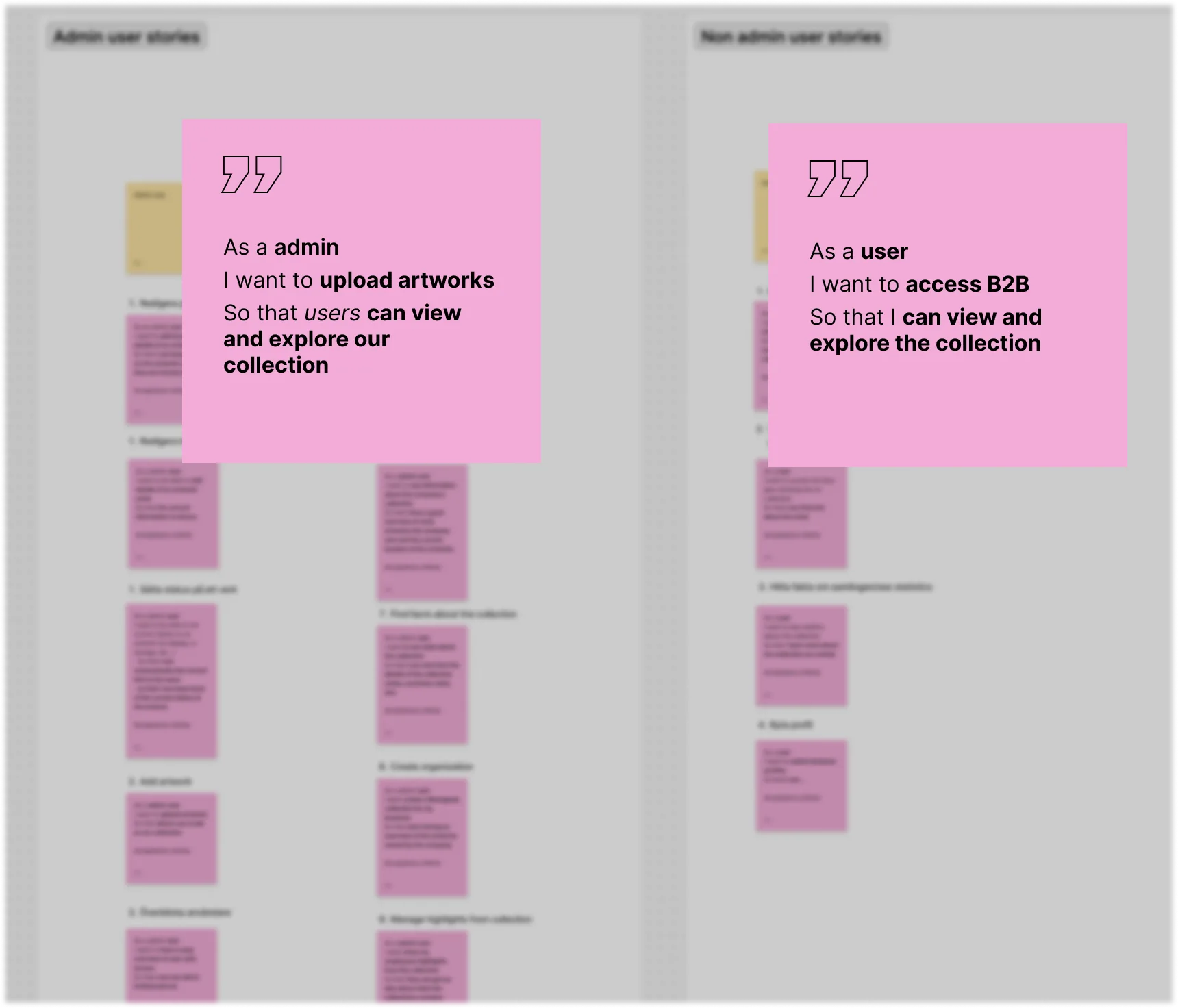
Process & research
UX challenge: scroll behaviour
Instead of a separate admin panel, the edit button puts the whole page into edit mode, so admins see something close to the final result while editing.
- AssumptionOnce you scroll past the edit button, it might get hard to tell what you're editing.
- TestWe tested the design in the dev environment to see if the risk played out.
- FindingIt did. On longer pages, the link between button and content got lost.
- IterationWe made the edit button and its heading sticky on scroll, as a subheading.
- ResultThe connection held, no matter how far down the page you were.
Results & learnings
The thorough planning phase paid off. The wireframes became a blueprint we kept returning to, whether we were building something new or reusing parts to save time, and it carried us through the harder parts, like designing for admin and user at the same time. Monogram for Business launches later in 2026.